
Terminal of Fashion
website redesign • UX/UI Design Case study • 2022
about the project
Terminal of Fashion (TOFF) is a luxury retail group that is known for its outstanding in-store shopping experience. TOFF is committed to ensuring that their retail shopping experience meets the same high standards as their online shopping experience. As a UX designer, my role in this project includes identifying areas for improvement and user pain points, designing desktop and mobile mockups, showcasing prototypes, motivating design choices, and leading design feedback meetings.
the problem
Terminal of Fashion’s current website feels outdated, and the user experience can be improved.
the goal
The main goal of this project is to build an online user experience that matches the offline experience a customer gets.
constraints
Little to no information about how the users are currently interacting with TOFF’s website was available, and the team did not dispose of usability testing resources for this project.
design process
Analysis
Identifying pain points
Ideate
Identifying solutions
Design
Color and typography
Mockups
Prototyping
In order to give Terminal of Fashion’s website a proper glow-up, I first had to understand what needed my attention. I ran a heuristic evaluation and was able to identify the following:
Some buttons are not working;
Some information is hard to find;
The layout does not display properly on desktop devices;
The icons are inconsistent and low quality;
Some buttons lack clear indication of their purpose and use;
Some elements cover the content.
Main areas that need improvement:
Information architecture;
Navigation;
Visual balance.
In order to validate my findings, I decided to run an independent usability testing on the current version of the website.
One of the tests I chose to run was a tree testing. I asked 6 users to find more information about Terminal of Fashion’s USPs: “Private shopping”, “Reserve and try” and “Free delivery and returns”.
6 out of 6 users failed to find information about “Private shopping”;
6 out of 6 users failed to find information about “Reserve and try”;
3 out of 6 users failed to find information about the “Free delivery and returns” policy.

Terminal of fashion’s USPs: Private shopping, Reserve and try and Free delivery and returns.
The information about free delivery and returns was located in the product details.
The information about the other two USPs was located underneath the product details. Additionally, by scrolling to the footer of the page, a link called “Returns info” can be found.
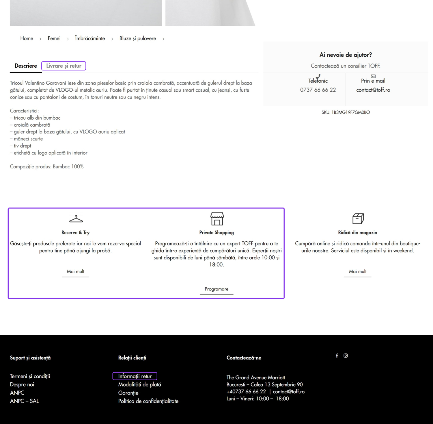
Location of the USPs short descriptions and text buttons linking to pages with more information - old website (before the redesign process)
In order to facilitate easier navigation for this particular matter, I presented the client with the possibility of adding links to each of the USPs presented on the gray news ticker. The links will take the user to individual pages for each of the USPs.
As requested by the client, the UPSs kept their initial position on the product page. The visual balance of the elements and icons has been improved or changed altogether, as appropriate. The “Delivery and returns” tab in the product description kept its initial position.
design
The client wanted a clean, minimalist look for their website so that the main focus stayed on the products. As a result, we’ve explored a neutral color palette consisting of black, white, and shades of gray. The final color selection has been defined further in the process.
mockups
I first started reworking the home page, improving the catalog and the product view page. The placeholder text is present in the mockups as per the client’s request. Their team of copywriters will be engaged in the implementation process to customize the descriptions “Lorem ipsum” now mimics.
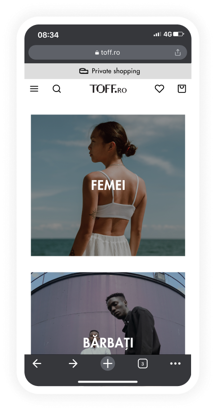
HOME PAGE
The old home page did not comply with several heuristic principles:
UI elements lacked consistency;
Typos were present;
The overall visual balance left room for improvement.
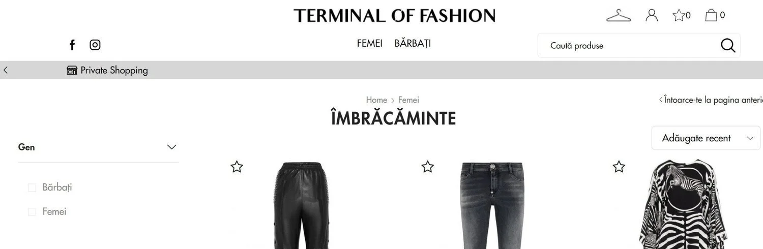
Desktop
Old home screen - top section
New home screen - first mockup - top section

Mobile
Old homepage

New homepage
CATALOGUE PAGE
The overall visual balance of the catalog page left room for improvement.
Desktop
For the desktop layout, the breadcrumbs have been repositioned, and spacing consistency was added to improve navigation and readability.
Old catalogue page - top of the screen
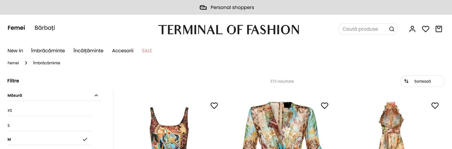
New catalogue page - first mockup - top of the screen
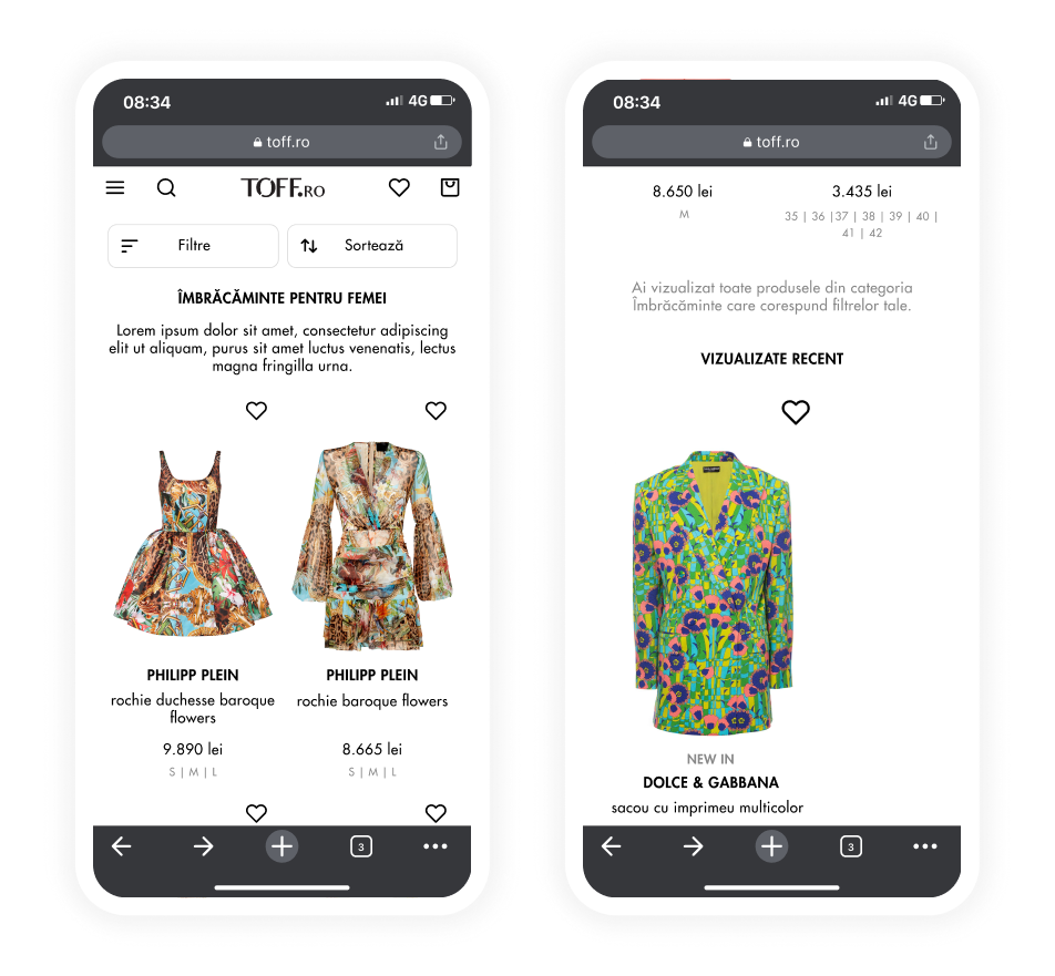
Mobile
The new mobile layout for the catalog page received the following changes:
Consistent spacing for improved readability;
Font and color adjustments to improve visual hierarchy;
New button layout applied to “filters” and “sort” functionalities for improved navigation;
“Save to favorites” button repositioning for improved accessibility.
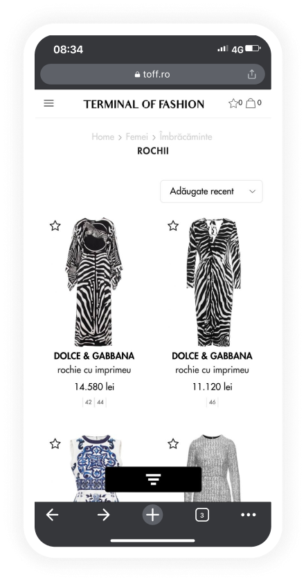
Old catalogue page
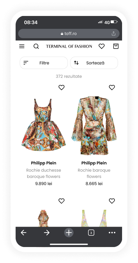
New catalogue page - first mockup
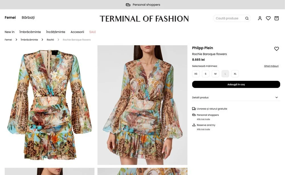
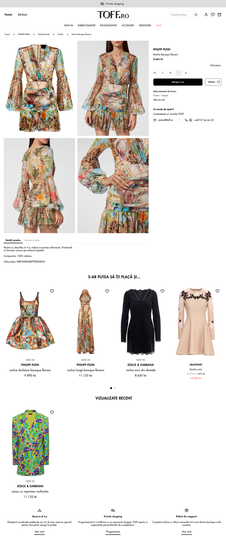
PRODUCT PAGE
Desktop
The desktop layout received the following changes:
Breadcrumbs realignment and “size guide” button for improved navigation;
Spacing consistency for better visual balance;
Improved visual balance for increased readability.
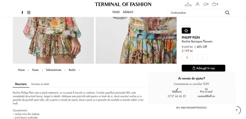
Old product page - scrolling behavior
New product page - first mockup
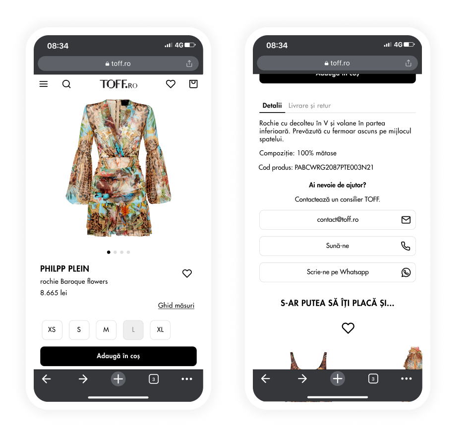
Mobile
The new mobile layout ought to increase item description readability, overall navigation, and visual consistency.
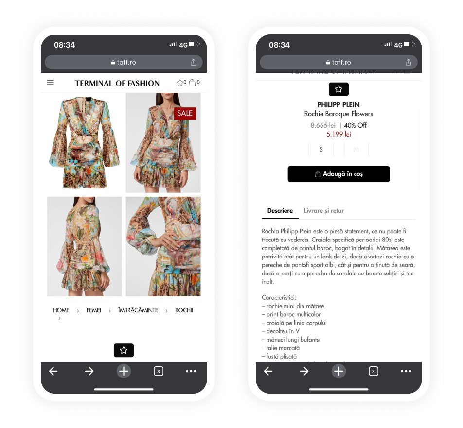
Old product page

New product page - first mockup
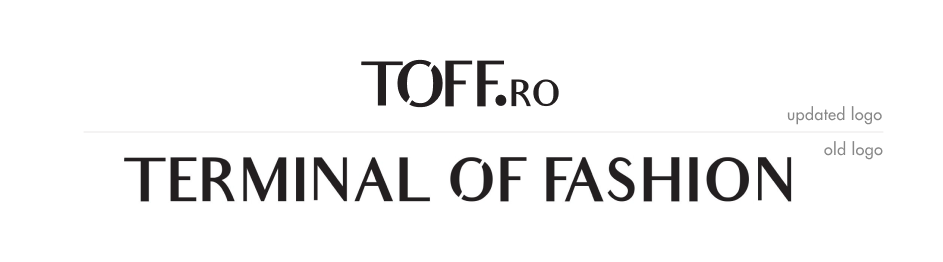
logo update
During the website makeover process, Terminal of Fashion changed their logo, and a shortened version of the design was selected.
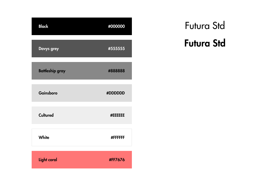
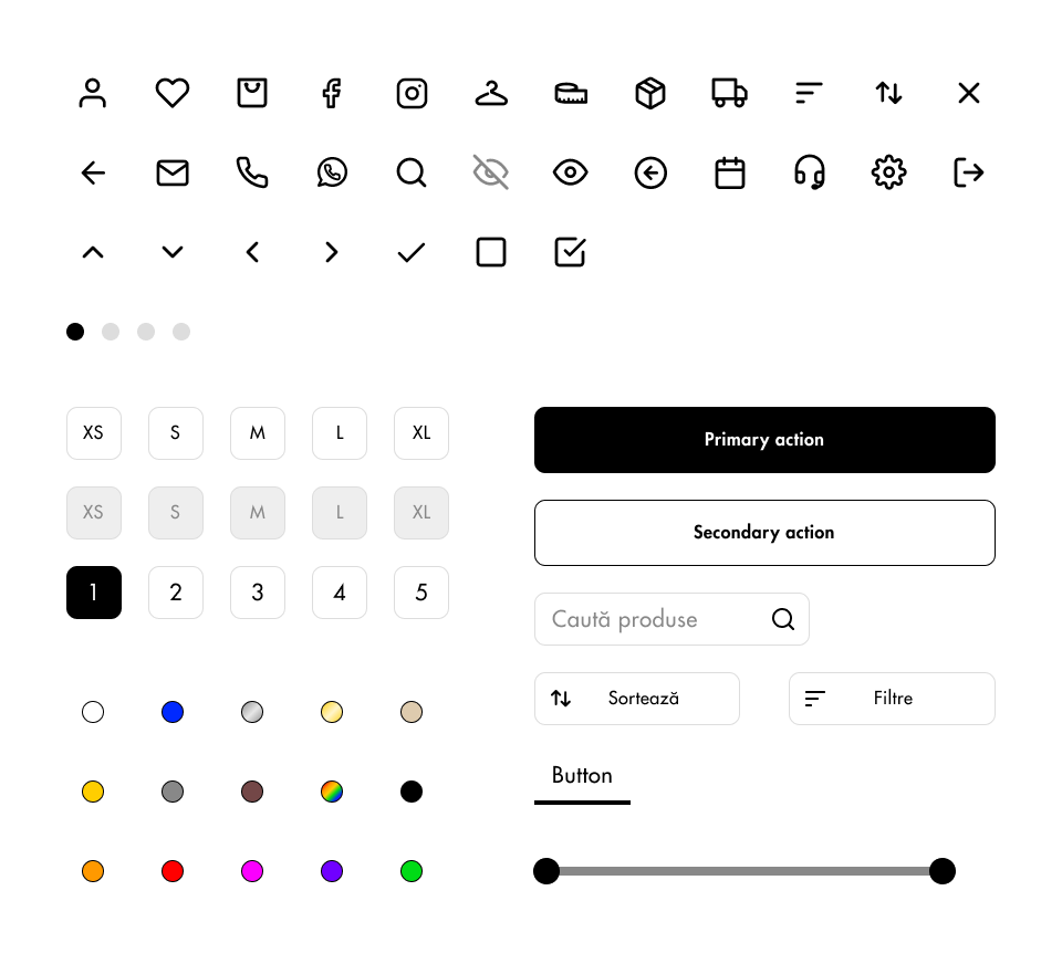
colors, typography & UI elements
We’ve opted for a neutral palette consisting of black, white, and shades of gray. In addition to that, an accent color was needed to act as an enhancement for items listed on sale, so we’ve settled on a shade of coral red.
final designs
The mockups presented above have been subject to multiple iterations. Additionally, we’ve explored multiple typefaces but found that, for the time being, the client prefers the typeface their website currently uses.
general changes
The typeface has been reverted to the original one (Futura Std);
Decreased the roundness of the buttons;
Increased spacing between elements;
Changed the left alignment to centered alignment on some elements;
Added headers for the catalogue page;
Improved consistency of the secondary action buttons’ look.
home page
The home page has been simplified and now only consists of two categories: women and men;
catalogue page
The catalogue page now includes a header consisting of the category’s name and a block of text the TOFF team will adapt to their needs at given times;
The “Color” section in the “Filters” block now includes a preview of the colors to help the user find the ones they are looking for faster;
The mobile view of the catalogue page now displays the available sizes for each item.
product page
The product page now includes a different layout for the “Need help?” section inside the floater that maintains its position when the user is scrolling;
The carousels presented in the mobile designs have been simplified: on a full mobile screen, they now display as a 1 + 1/2 of a product instead of 3.
The final designs for this project are displayed below:
DESKTOP
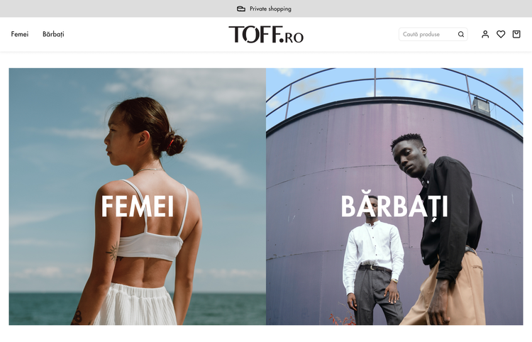
Homepage
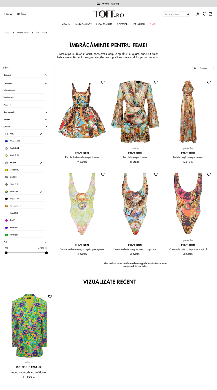
Catalogue page
Product page
MOBILE
Homepage
Catalogue page
Product page
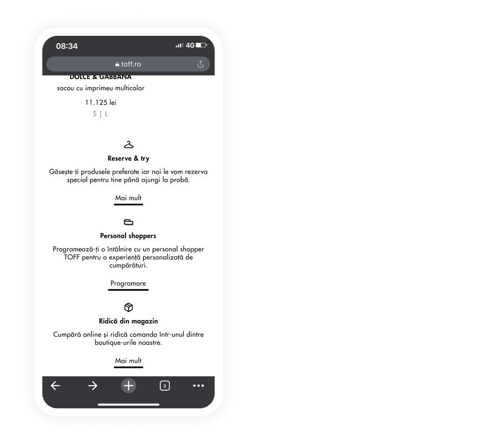
Product page
The work that resulted from the collaboration with the Terminal of Fashion’s team will soon be live on their official website: toff.ro.
takeaways
recollection
This project taught me a lot about designer - client interaction. Here are the most valuable lessons:
Listen closely to how the client expresses their needs. Sometimes the client may not communicate directly about what makes them happy, so I had to learn how to look at things the right way, give them shape, and offer them the place they deserve.
Make sure to show the client how the product will look on a real device throughout the development process. Not only does this showcase the interaction a customer will have with the final product, but it also aids the decision-making process on the client’s side during the feedback sessions. Additionally, it helps the client better understand what to expect further in the process and the impact design changes may have.
Document everything. Since a project like this one involves multiple feedback sessions, it’s easy to let details slip away. I learned that taking notes and using checklists are crucial for the design process and time management.
Save the previous versions of the project. There were times when I found myself in a position where, after multiple feedback and brainstorming sessions, the client decided they liked some elements we included in past versions of the screens. Saving old work helped me streamline the design process and allowed me to stay focused on improving my latest designs rather than spending time trying to replicate features from memory.
a glimpse into the future
I think Terminal of Fashion’s website may be able to greatly benefit from a feature that generates personalized recommendations based on the customer’s shopping history. I believe such a feature would be a good replica of the offline experience that Terminal of Fashion tailors for their clients. A highly personalized online shopping experience ought to be a powerful tool for driving conversions.