

Cosmily
UI/UX Case study • 2022 - 2023
about the project
Cosmily is a tool that analyzes ingredient compatibility in skincare products and provides customized insights on skincare routines built by its users.
the goal
Our team aimed to improve the existing user experience on Cosmily, enhance the product’s fundamental functionality — the ingredient checker— further broaden the features it provides, and deliver an MVP for the premium version of the product.
my role
As a UI/UX designer, I worked on developing the MVP for the Cosmily Premium experience as well as the design system and overall product improvement, with an emphasis on the routine compatibility and ingredient checker functionalities.
research
In order to better understand the competitive landscape and the experience that Cosmily’s users might be expecting or needing, we ran a competitive analysis. By identifying some gaps in our competitors’ products, we were able to cover those areas in our designs and establish a roadmap for our product.
design process
We started off by tracing a roadmap with the business’ goals in mind: providing premium users with the most value out of the current version of the product and improving the overall experience for the free version of Cosmily. Some of the highlights of the roadmap included:
redesigning the homepage
onboarding process improvements
including more personalized content
copy, filtering, search and navigation improvements
upgrading existing features (routines, product comparison)
adding new features (community discussions, roadmap transparency, role badges)
Homepage
The former homepage design was rather confusing and appeared more like an “about” page with a CTA that did not provide accurate information on its effects. It had too much text and was not easily scannable.

Top section of the old homepage - desktop view
The “Learn more” button did not take the user to a page where they could actually learn more about the product, but to the ingredient checker, Cosmily’s core functionality.

Ingredient checker
Aiming to shorten the time it takes for the user to get to the core functionality of the product, we opted for a design that is not only more streamlined but also offers a brief overview of what is in it for the user:
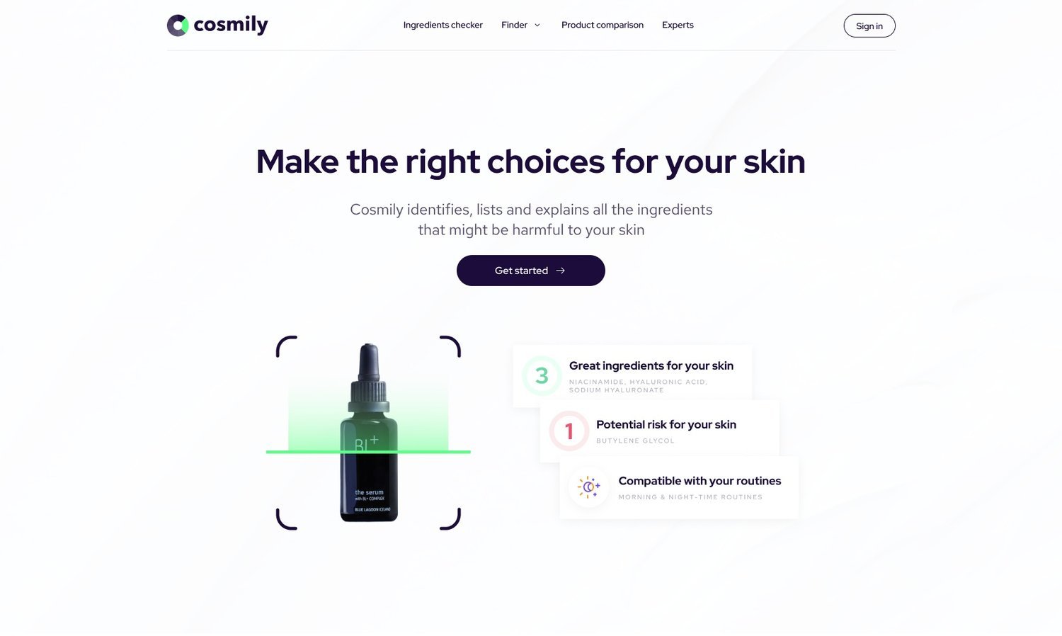
Top section of the new homepage - desktop view
Personalized content
As part of the onboarding process, the users have to take a skin quiz that gives Cosmily data it can use to provide the best recommendations according to certain skin traits and types. The old skin quiz did not provide enough quantitative data and instead focused more on qualitative data. We adjusted the skin quiz so that it leaves less room for interpretation-based answers.
Upon analyzing the current state of Cosmily, we were able to identify a need for a more personalized overall feel to the product. The users’ interaction with Cosmily starts with a personalization step that fails to provide enough information on how the test results are going to impact their experience with the tool. To address that, we decided to create skin profiles. The skin profiles are here to inform the user about the data that Cosmily uses, as well as to reinforce through visual feedback that the experience provided by the tool is tailored to their needs.

Top section of the new homepage - mobile view

A user’s skin profile after skin quiz completion
Cosmily premium
Creating a premium version for Cosmily, which is itself in an MVP state as of now, was quite a challenge. With personalization being a primary focus area for the Cosmily experience, we decided to push the objective of maximizing the tailored content it provides even further. Our ideation sessions on how we may deliver such an experience concluded as follows:
Cosmily Premium will provide users with a compatibility report at a routine level (free version of Cosmily does not provide cross-compatibility reports over products in a routine)
Cosmily Premium will allow users to check whether another user’s routine is a good fit for their skin profile
Cosmily Premium will provide unlimited ingredient list checks (free version of Cosmily only offers 5 checks per month)
Other: Premium users will receive a “premium” badge visible to all users and a premium look of their profile dashboard
Going further, we started defining user flows, information architecture, and constructing the wireframes on which Cosmily Premium will be built.
takeaways
Being part of Cosmily’s UI/UX design team was a great learning experience that has allowed me to work with amazing professionals and develop my skills. Through our collaborative efforts with the frontend and backend teams, we were able to build solutions that respond to user needs and pain points and approach these issues in a user-centered manner.
Some of the challenges I faced while working on this project included:
Having to build designs based on backend structures despite not having expertise in backend coding. Overall, this challenge taught me how to work within the constraints of the backend systems and to ensure that my designs met both user needs and technical requirements.
Developing a premium version of Cosmily, which is currently in an MVP state. The product has a limited set of capabilities as an MVP, and the emphasis is on delivering the main value proposition to users. This task required a comprehensive understanding of the product's limitations. In order to identify the features that users would be willing to pay for, we focused on unmet needs that could be addressed through a premium version. Delivering Cosmily Premium required close collaboration between design, development, and product management, as well as a deep understanding of user needs and technical constraints. In the end, we were able to create Cosmily’s premium version by enhancing its value proposition and paving the road for monetization.
a glimpse into the future
We are looking to address more of the following in the future:
Adding better visual cues for certain actions (e.g.: providing a preview for images being uploaded, displaying product pictures as part of the routine preview)
Rewriting various microcopy to improve clarity and match user expectations (e.g.: naming consistency)
Changing content layout to improve browsing experience (e.g.: “routines” page)
Adjusting user flows as to reduce input needed from the user (e.g.: product comparison feature)
Switching from numbered pagination to infinite scroll
Changing the design for some buttons (e.g.: providing microcopy instead of/alongside already existing icons, changing some buttons to secondary action buttons)
Making it possible to navigate back and forth through the onboarding process
As a user experience designer, I am eager to continue building upon the skills and knowledge gained through the completion of this project and to apply them in future endeavors. I am confident that my team’s work on Cosmily contributed significantly to its development and future success.
You can get the full Cosmily experience on their official website.
2023 Update: Unfortunately, due to unforeseen circumstances, Cosmily’s development has been put on hold at the beginning of 2023.