
Cohesive widget design
UiPath • 2024
overview
The cohesive widget design within Studio Web initiative focused on unifying the user experience of the collection builder, condition builder, dictionary builder, and filter builder widgets, with newly defined patterns being extended to other areas of the product.
collection builder
Updated collection builder vs. old collection builder
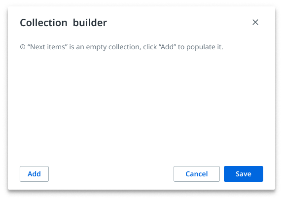
Collection builder empty state - updated
· includes a “hint” text that gives the user information about the potential consequences of their actions, thus contributing to error prevention and providing visibility of system status
· includes a “close” button
· includes a breadcrumb that provides the user with context, reducing their memory load
· uses a layout that is consistent with the ones similar widgets are built upon

Collection builder empty state - old
· had a confusing empty state
· lacked context
· had poor visual balance
condition builder
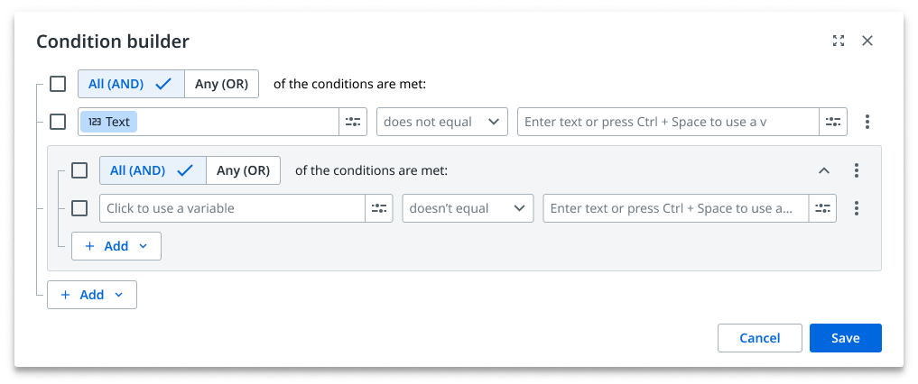
Condition builder - updated
· improved layout to ensure consistency with other widgets
· a ”close” and “expand” buttons have been added
· an expand button to allow the user to view extensive content when necessary
· collapsed groups now inform the users on how much content is hidden
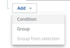
· added “+” icon on the “add” button to better describe the button functionality as both a dropdown menu and a way of adding items to modal


Condition builder - old
· lacked consistency with other existing widgets
· had no explicit way of being exited; the user had to click outside the modal to close the modal
· collapsed groups do not inform the user on how much content is hidden
· collapsed groups now inform the users on how much content is hidden
· “add” button did not clearly embody both of its functionalities
Updated condition builder vs. old condition builder


dictionary builder
Updated dictionary builder vs. old dictionary builder:
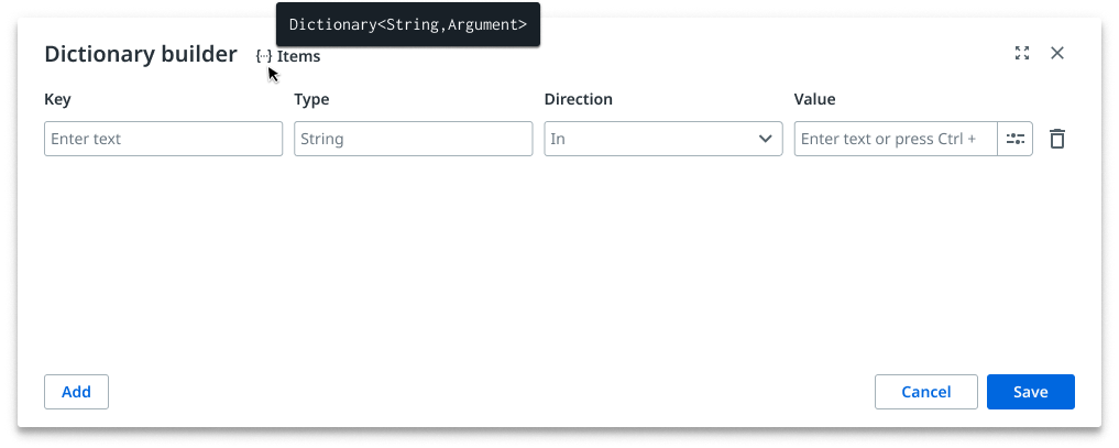
· the empty state is now clearer and offers the user a starting point
· activity name has been removed from the breadcrumb and the data type has been hidden behind its corresponding icon; name now appears on hover

· had a confusing empty state
· the breadcrumb took way too much space (activity name + data type)
filter builder
Updated filter builder vs. old filter builder:

· improved layout to ensure consistency with other widgets
· improved ratio between input fields to ensure enough space is available for text to remain on display

· inconsistent layout with other widgets (see logical operators “and”, “or”)
Thanks for coming this far! You can go back to the page describing my work at UiPath by clicking here.